A comprehensive transformation of Yummly’s brand identity to drive growth and support the company’s evolving business strategy
Background
After five years without a brand refresh, Yummly’s visual identity had become outdated and was failing to differentiate itself in an increasingly crowded marketplace. The brand no longer communicated Yummly’s unique value proposition or reflected the company’s distinctive personality and so, with backing from the Whirlpool Advisory Board, the decision was make to undertake a brand redesign as a strategic growth initiative.
Our goal was to execute a complete reinvigoration that would re-establish as the market leading cooking app and more authentically represent Yummly’s unique character.
Strategic Positioning
We kicked-off the process with a 2-day ‘Brand Fight’ workshop facilitated by Whirlpool’s in-house brand experience agency, WoW Studios. Marketing and design leaders from Yummly, Whirlpool, KitchenAid and JennAir collaborated together to crystallize and create more definition around Yummly’s brand positioning.
The outcome of the workshop was clear definition around the core positioning of the brand: The brand archetype (‘The Jester’), Yummly’s brand opportunity, core idea, and a positioning statement.
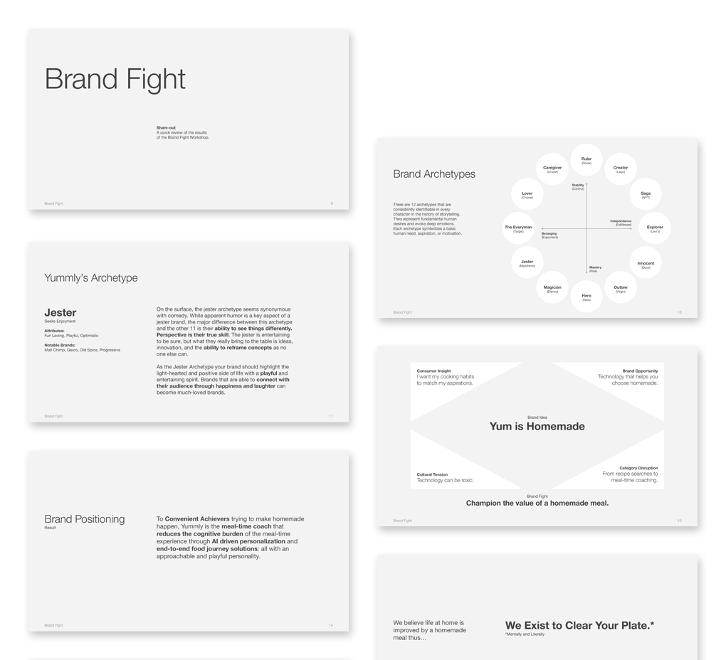
Design Principles
The outcomes of the workshop were then used as a foundation for us to develop a guiding set of Design Principles. This set of tenets would form an enduring element of the brand architecture, providing not only a set of guardrails for authentic expression throughout the redesign process, but also for informing creative decision-making over the long term.
After a few rounds of refinement we landed on four core principles:
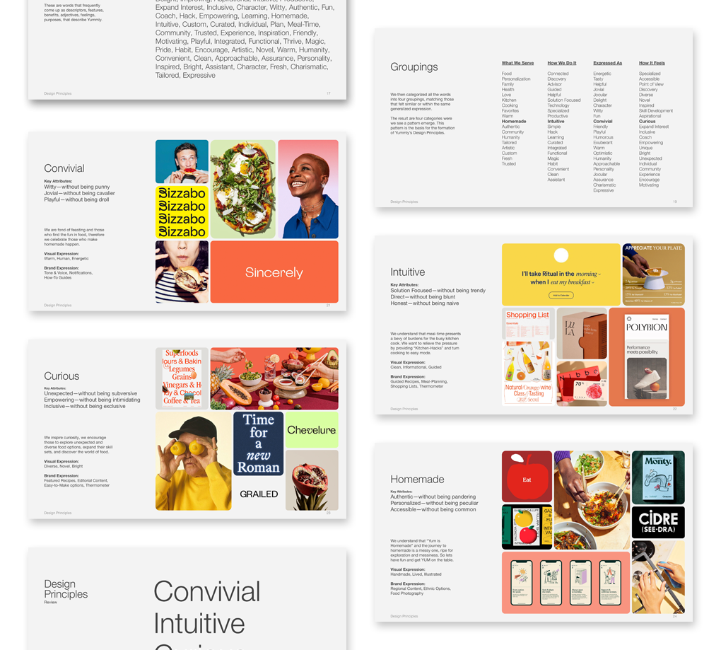
Convivial
Intuitive
Curious
Homemade
Visual Identity
During the Visual Identity development phase, we took the strategic foundation from our Brand Fight workshop and brought Yummly’s refreshed personality to life through visual design. This meant reimagining every core brand asset—completely reimagining the logo, expanding the color palette, and updating typography to create a cohesive visual language that genuinely felt true to Yummly’s convivial, playful character.
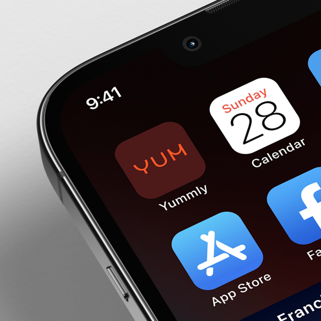
Logo Redesign
The logo was completely reconstructed, shifting from a cursive wordmark to a simplified, shape-based design. The new logotype features repeating bowl shapes, reminiscent of a convivial smile, to create flow and rhythm.
This visual device enables modular applications: a ‘Y’ monogram, useful for for avatars, and balanced ‘Yum’ brand derivatives, for example.
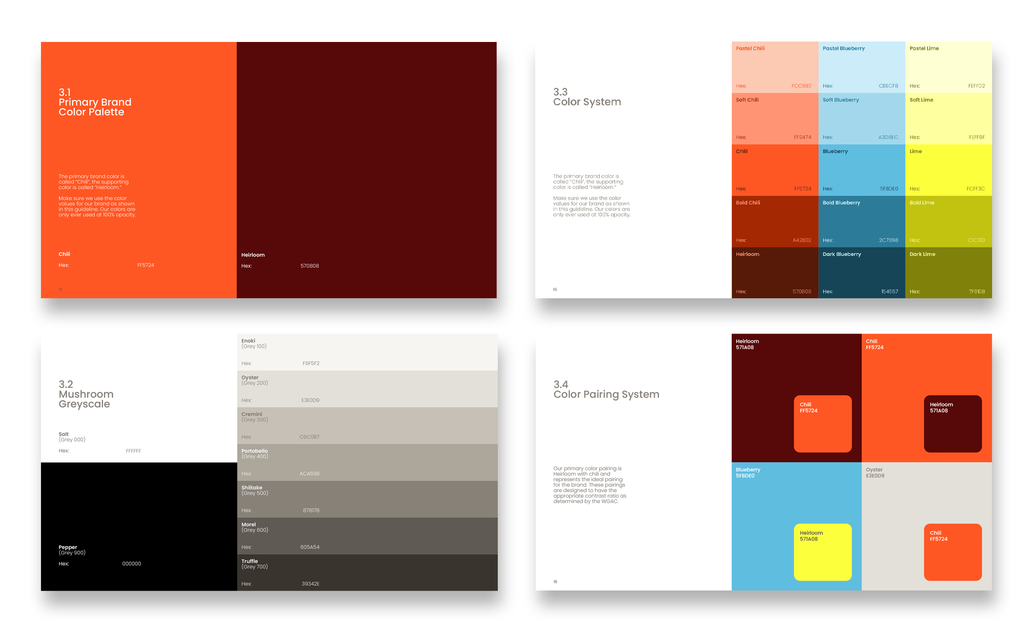
Color Expansion
The existing palette felt sterile, and lacked warmth and breadth. We overcome this by expanding the palette with more intensity and complementary hues, creating a color grid that doubled the palette size.
For usability and accessibility, colors received semantic, food-related names such as chili, heirloom, lime, and blueberry. while a series of primary and secondary color pairings were developed to ensure ADA compliance and streamline design decisions.
Typography
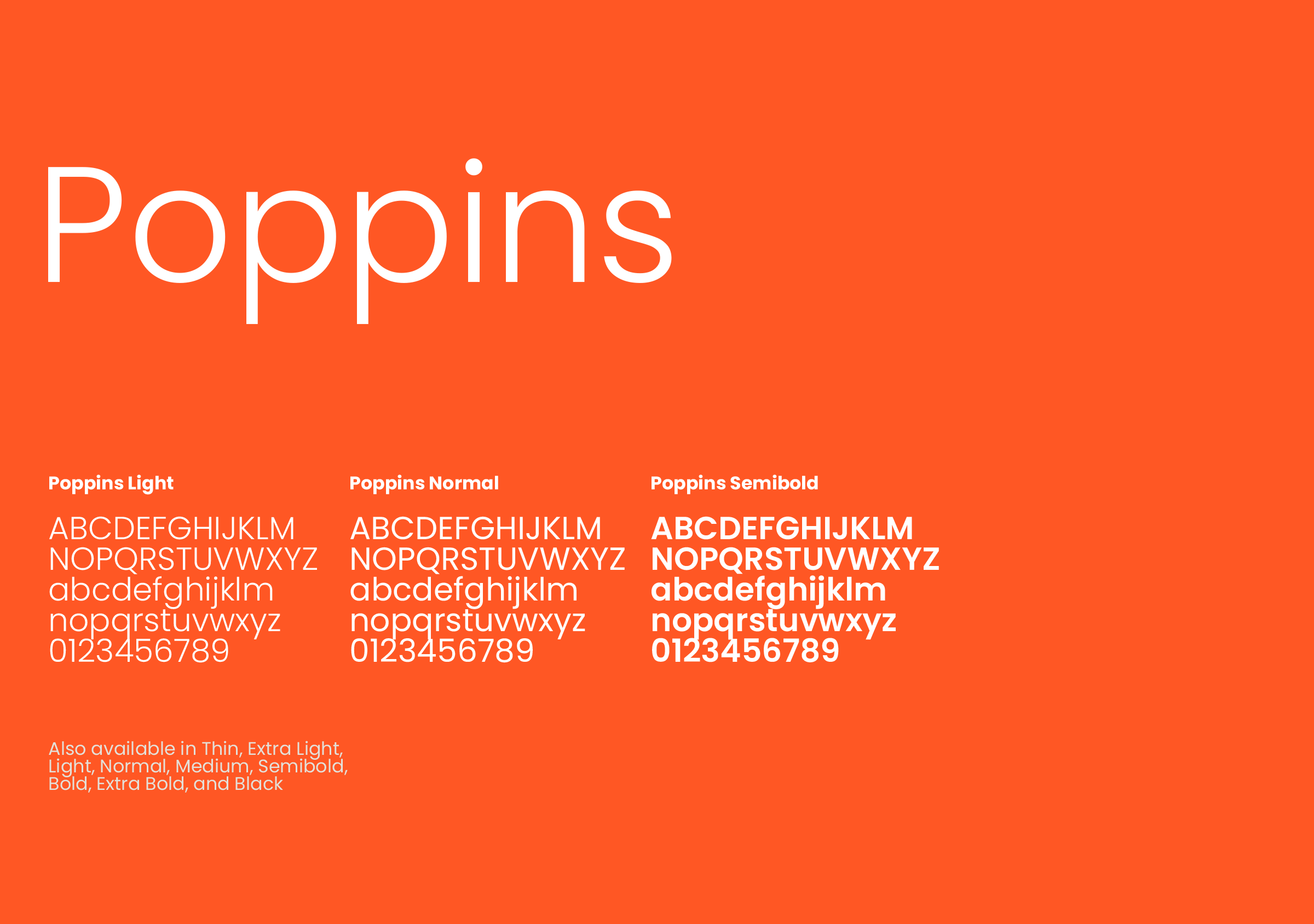
Europa was replaced with Poppins as the primary brand typeface, maintaining clean legibility while introducing geometric, bouncy letterforms that better suited Yummly’s playful archetype.
Poppins’ open source license and its accessibility across Google GSuite applications was a critical factor in this choice, bringing about cost savings and its wide availability helping ensure brand consistency across all employee-generated materials.
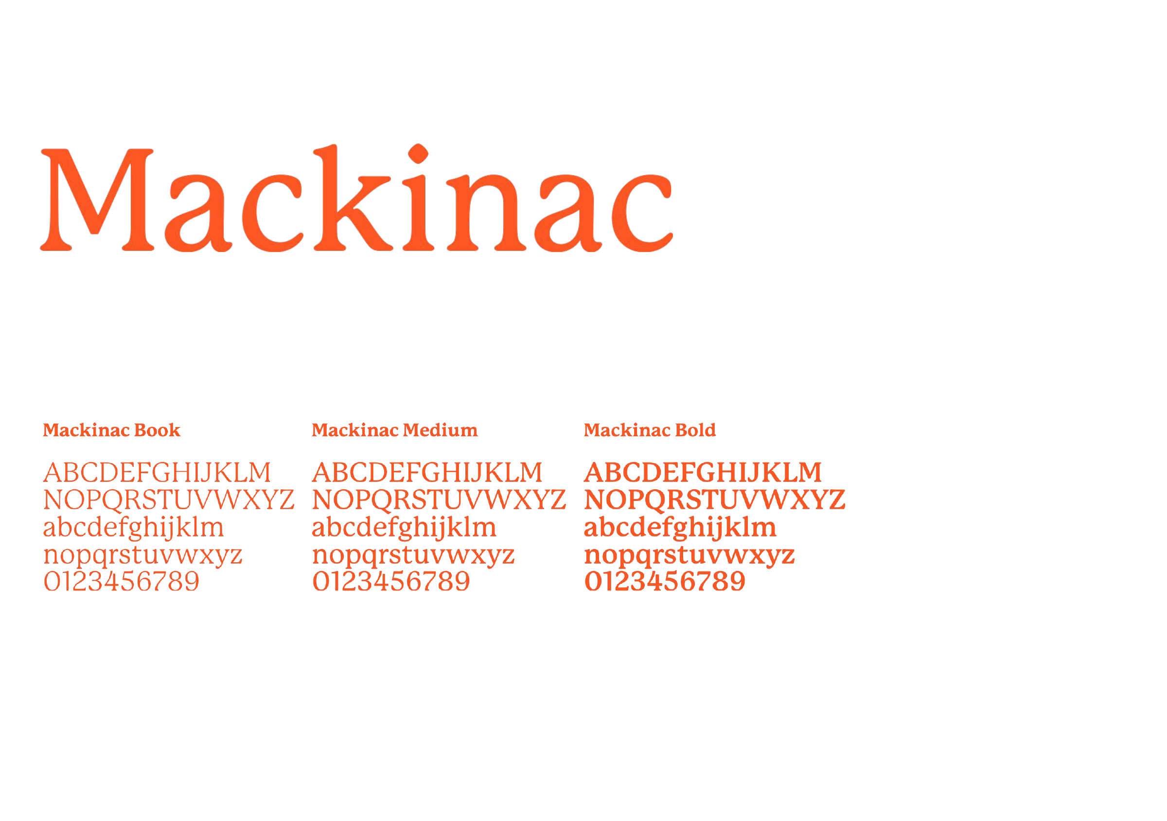
A secondary font, Mackinac, was also introduced. An old-style serif with diagonal weight stress and modest contrast between thick and thin strokes, the typeface complements the modernity of Poppins’ san-serif structure.
This pairing creates a cohesive, modern yet crafted aesthetic perfect for food content, bringing an intuitive, contemporary digital energy with a crafted, artisanal quality.
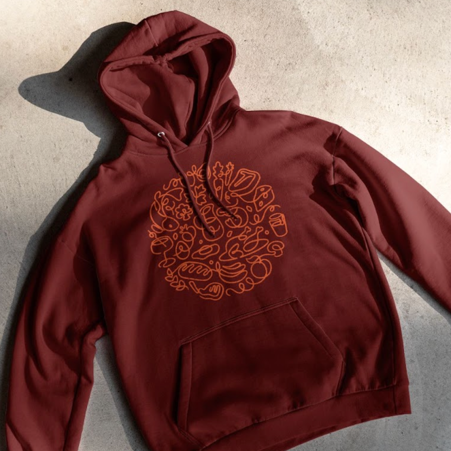
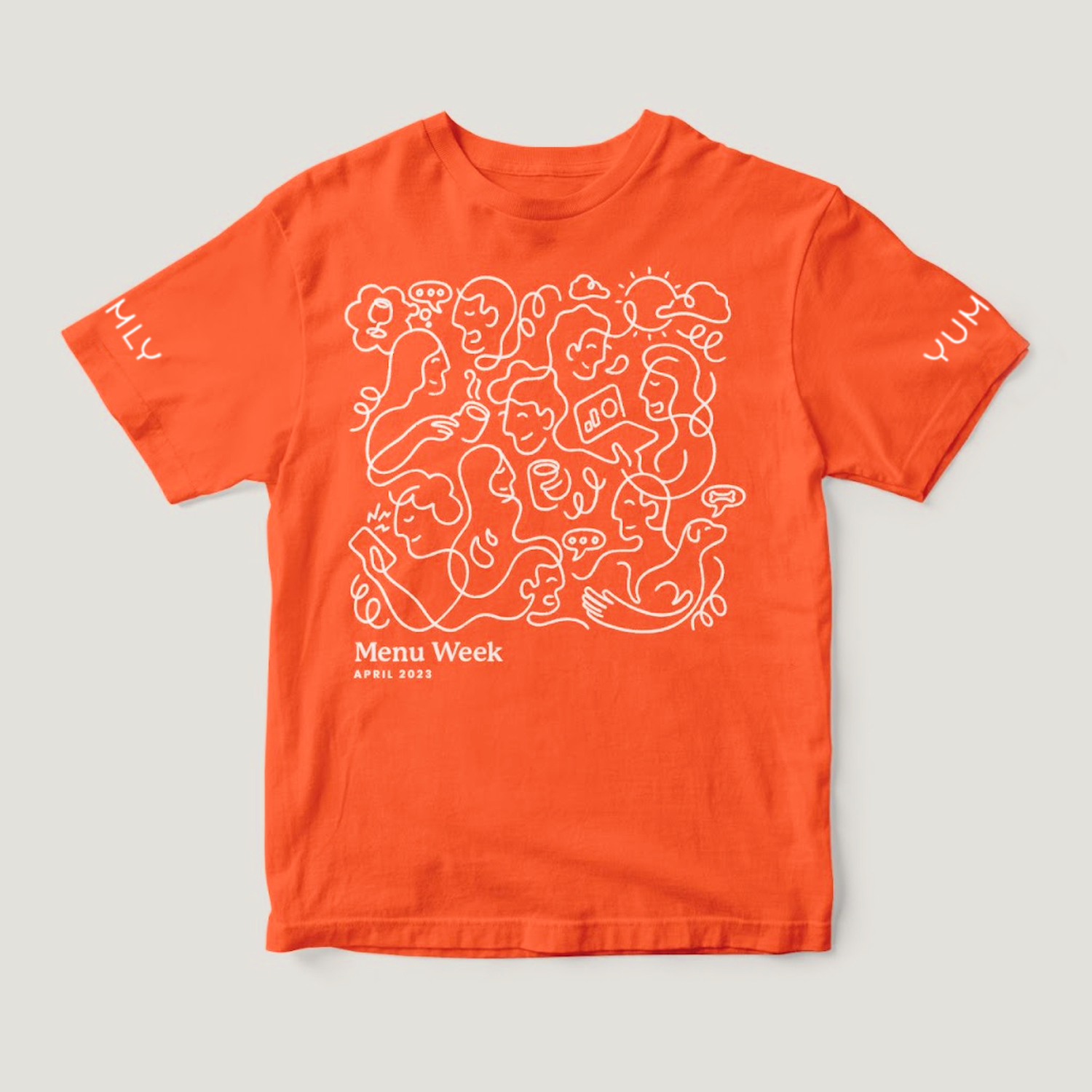
Illustration
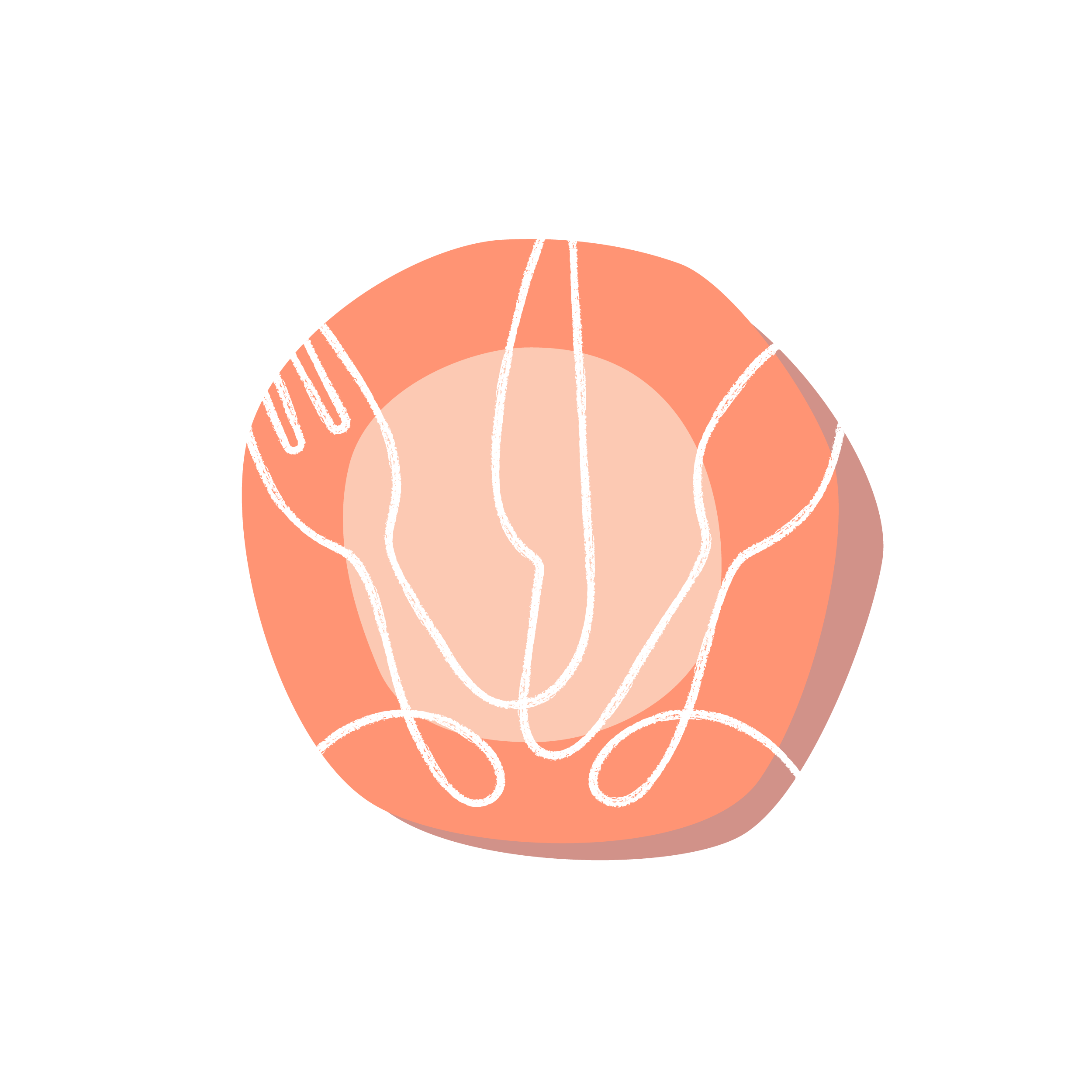
A defined illustrative style was developed using layering techniques, filling a critical gap in the brand’s visual toolkit and providing powerful creative flexibility.
The illustration system consists of two elements:
The primary layer is the “grease pencil” – Reminiscent of a crayon writing on butcher paper, the grease pencil is a flowing hand drawn textured line that can be applied to any vector outline at scaled thicknesses.
The secondary layer is called “paper cut-out” – Roughly cut shapes mimicking the cutting of construction paper which is used to fill the artwork and give further depth to the illustration.


Photography
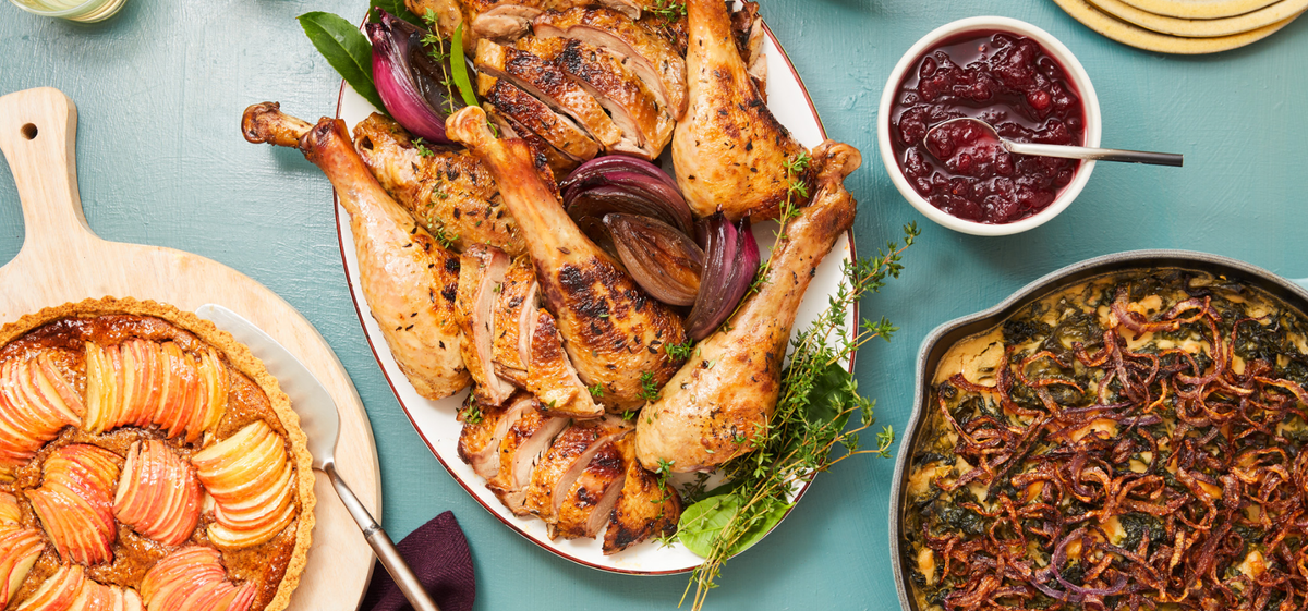
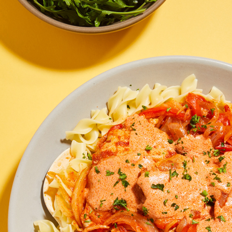
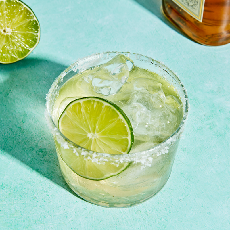
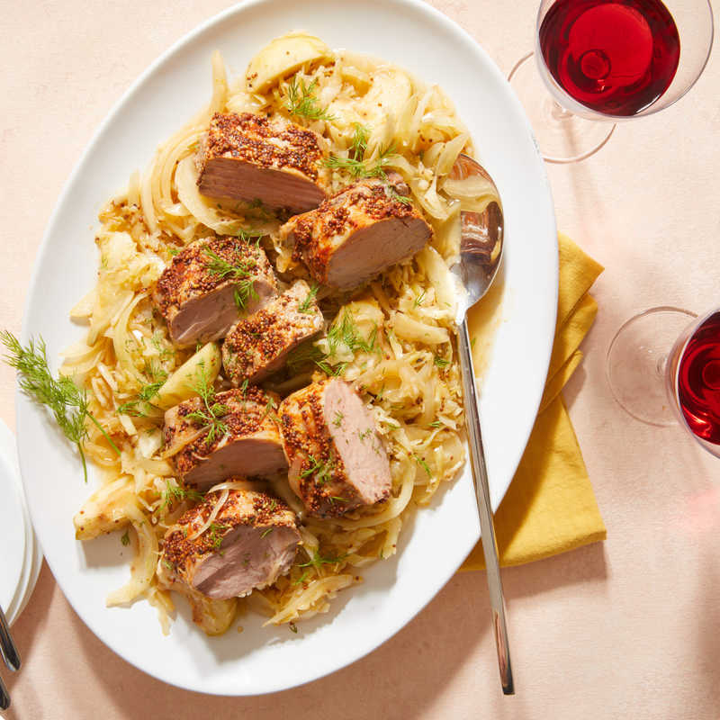
For photography, we developed comprehensive art direction that translates the design principles into specific photographic guidelines.
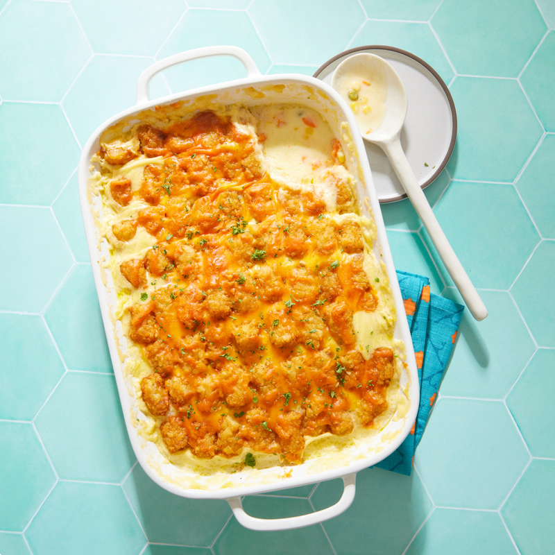
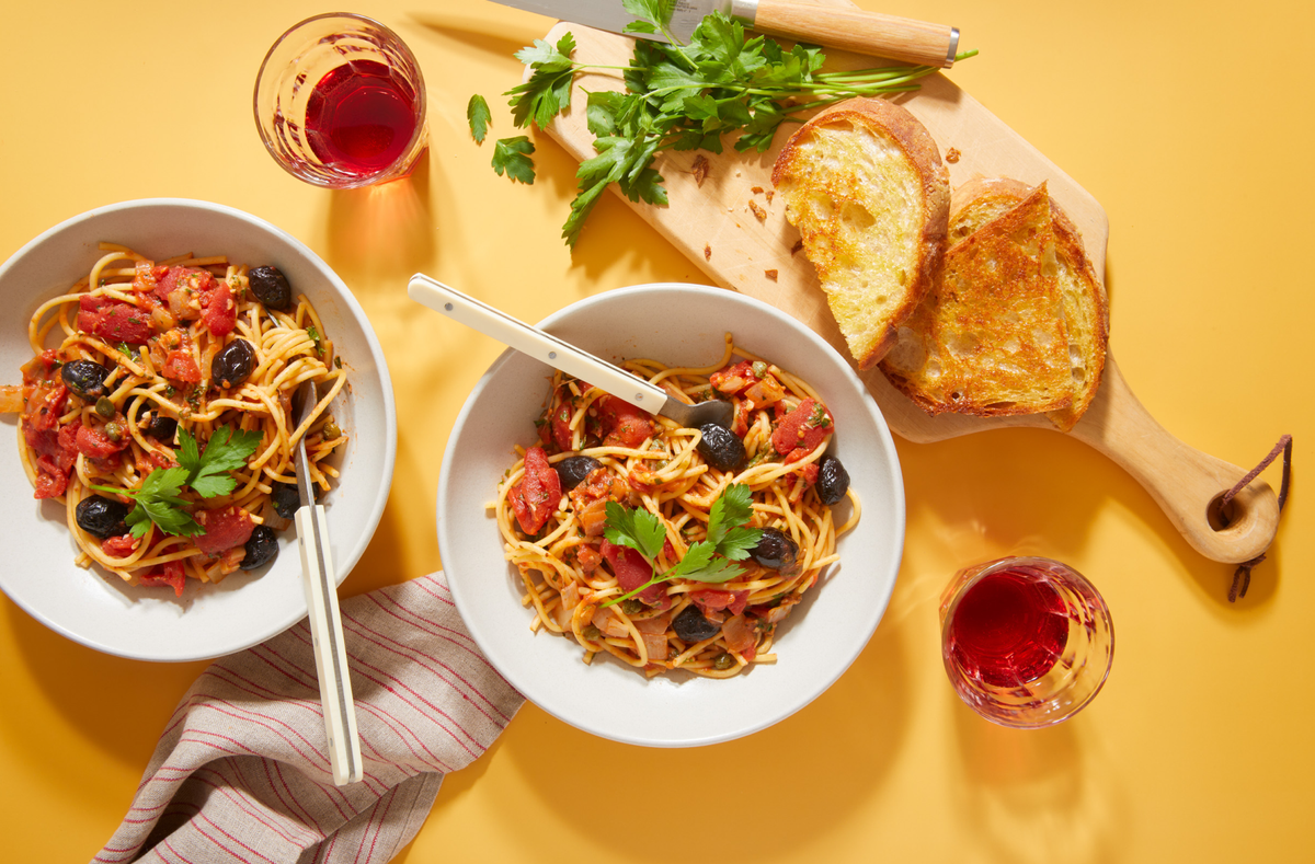
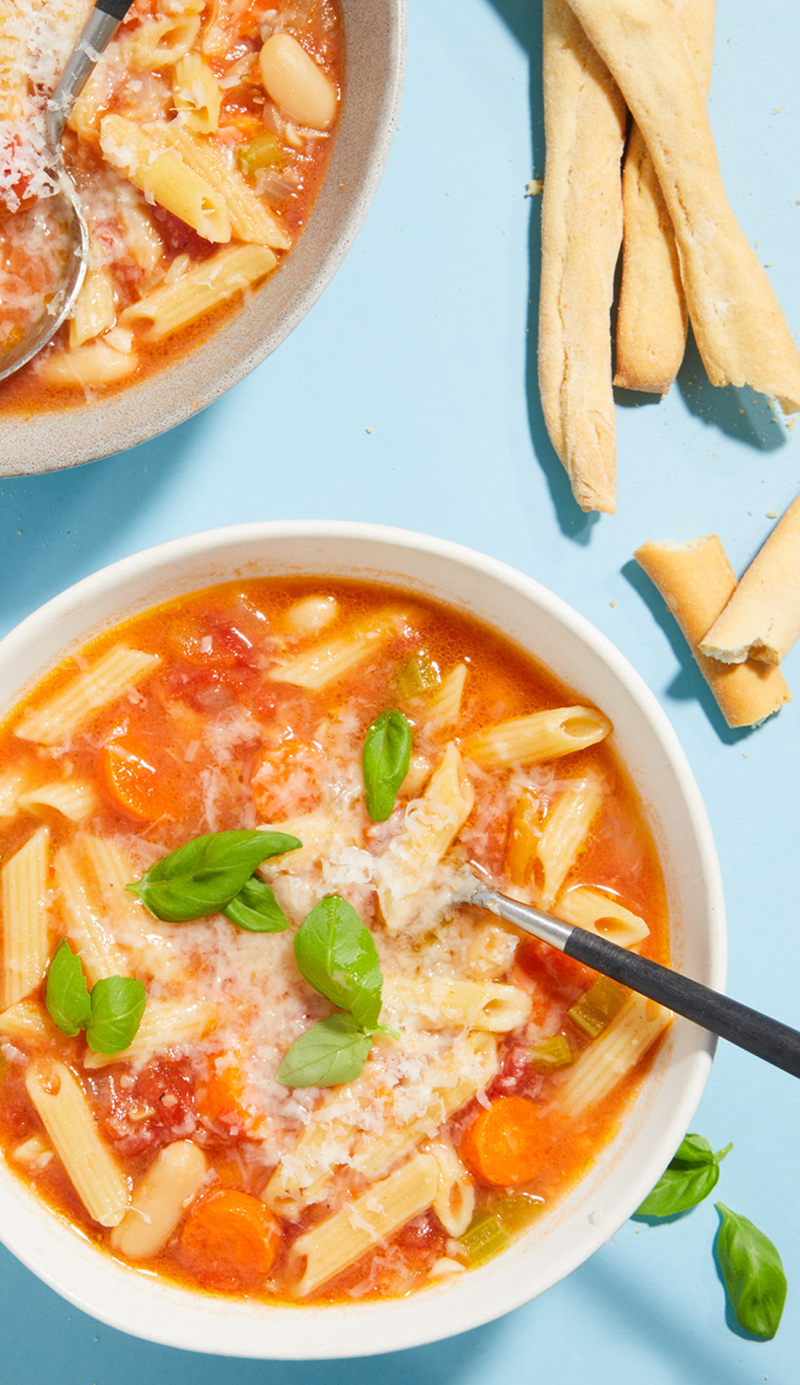
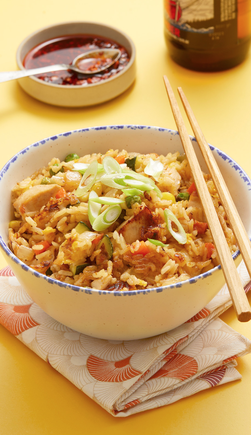
Our approach emphasized the use of bright, natural lighting with crisp shadows, the use of contemporary props and vibrant color, and strategic shooting angles to make the food the hero of the imagery.
Execution
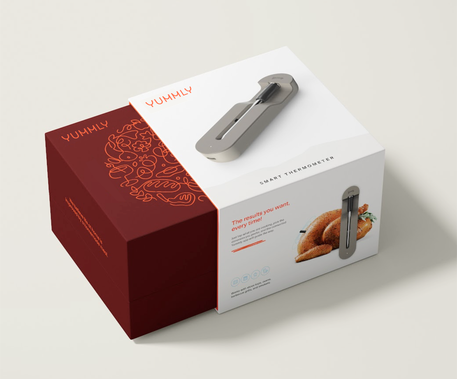
The final step in the creative process was applying the new design language across all critical brand touchpoints, bringing the elements together to define final execution. These outcomes would go on to infrom usage guidelines for production, ensuring consistent expression across a variety of applications.
Rollout
After positive focus group feedback and Whirlpool board approval, we launched a phased strategic rollout:
Phase one focused on internal implementation, road-testing the brand through comprehensive guidelines, Google GSuite templates, brand illustration libraries, and Adobe CreativeCloud assets. This ensured employees became brand ambassadors while identifying delivery issues before external launch.
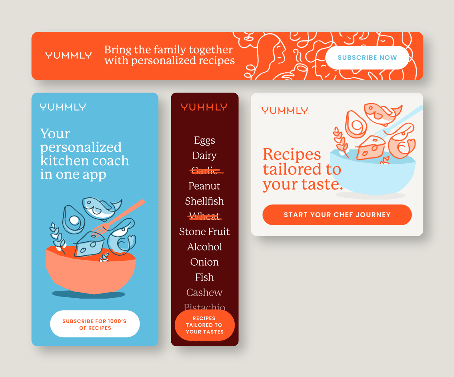
Phase two targeted external relaunch through content and marketing. We developed detailed tone and voice guidelines for writers covering everything from recipes to social media, plus photography art direction for Yummly’s network covering camera angles, lighting, and composition.
A soft launch approach through transient deliverables—Iterable email templates, App Store assets, in-app content artwork, and product marketing promotions—provided low-risk testing opportunities with A/B data gathering to refine execution before full deployment.
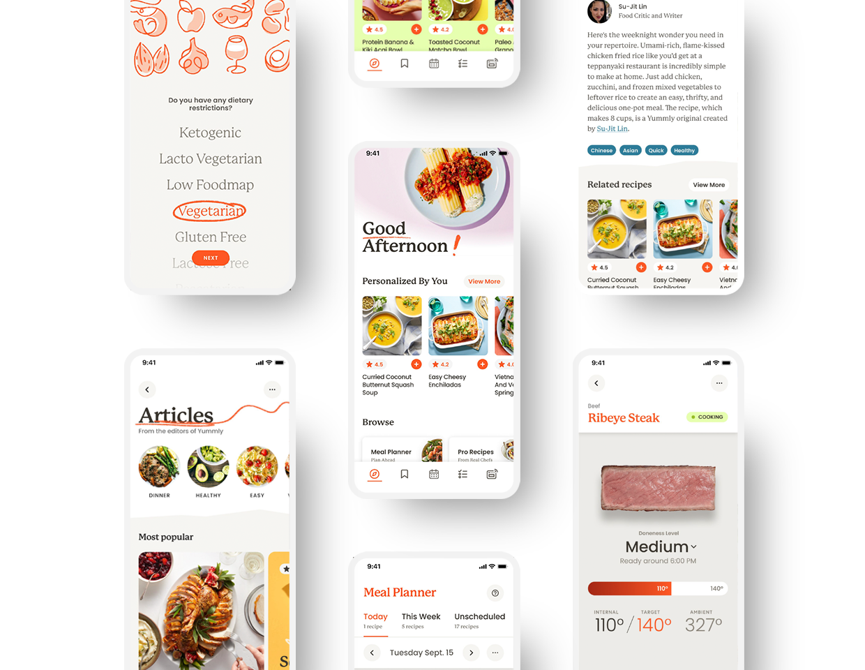
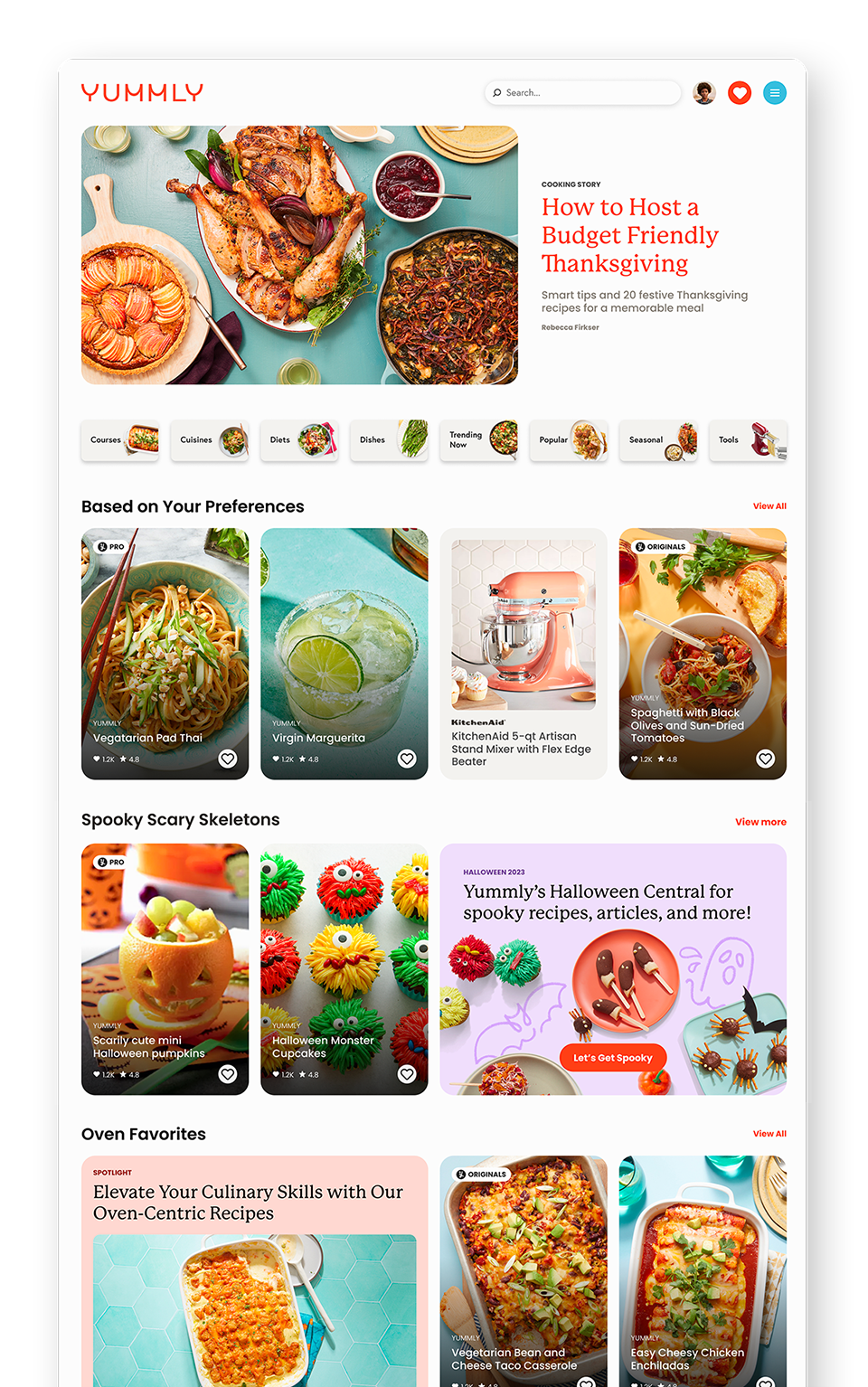
Phase three of the rollout was a full deployment across the product experience. Implemented through the Yummly design system, Pasta, this saw all elements of the UI being updated with the rebranded visual language. To implement revised UX copy standards, a production content management pipeline was put into place using Ditto — a centralized system connecting product, design, and development teams around a single product content repository.