A product design system created to optimize the Yummly product experience and drive higher standards and increased efficiency throughout the product development lifecycle
Background
While brand guidelines existed to guide designers, Yummly lacked a formal product design system. Designers and developers were in the habit of continuously recreating assets and UI patterns without a single source of truth, creating inefficiencies for both teams and undermining user experience consistency. An accessibility audit for ADA compliance revealed further problematic areas that would need to be addressed.
A planned migration from Sketch to Figma presented an ideal opportunity to architect and deploy a comprehensive product design system. Our task was to build a foundation that would transform the product development process and establish a scalable framework for future innovation.
Design Audit
The first step of the process involved conducting a forensic analysis of the product to catalog existing screen designs across web, iOS and Android platforms. This comprehensive review enabled us to identify core repeating interface elements and document pattern inconsistencies requiring resolution.
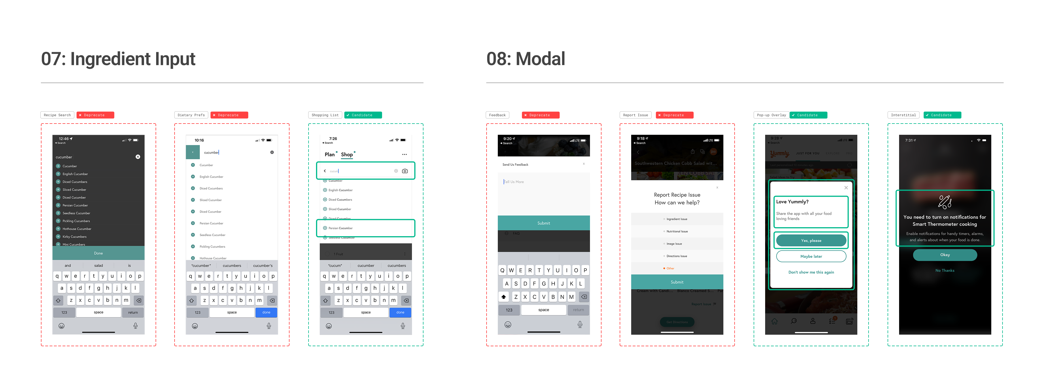
From this initial assessment, we drafted a foundational architecture comprising 17 core elements with over 50 variants, establishing a categorized baseline for organizing components.
System Architecture
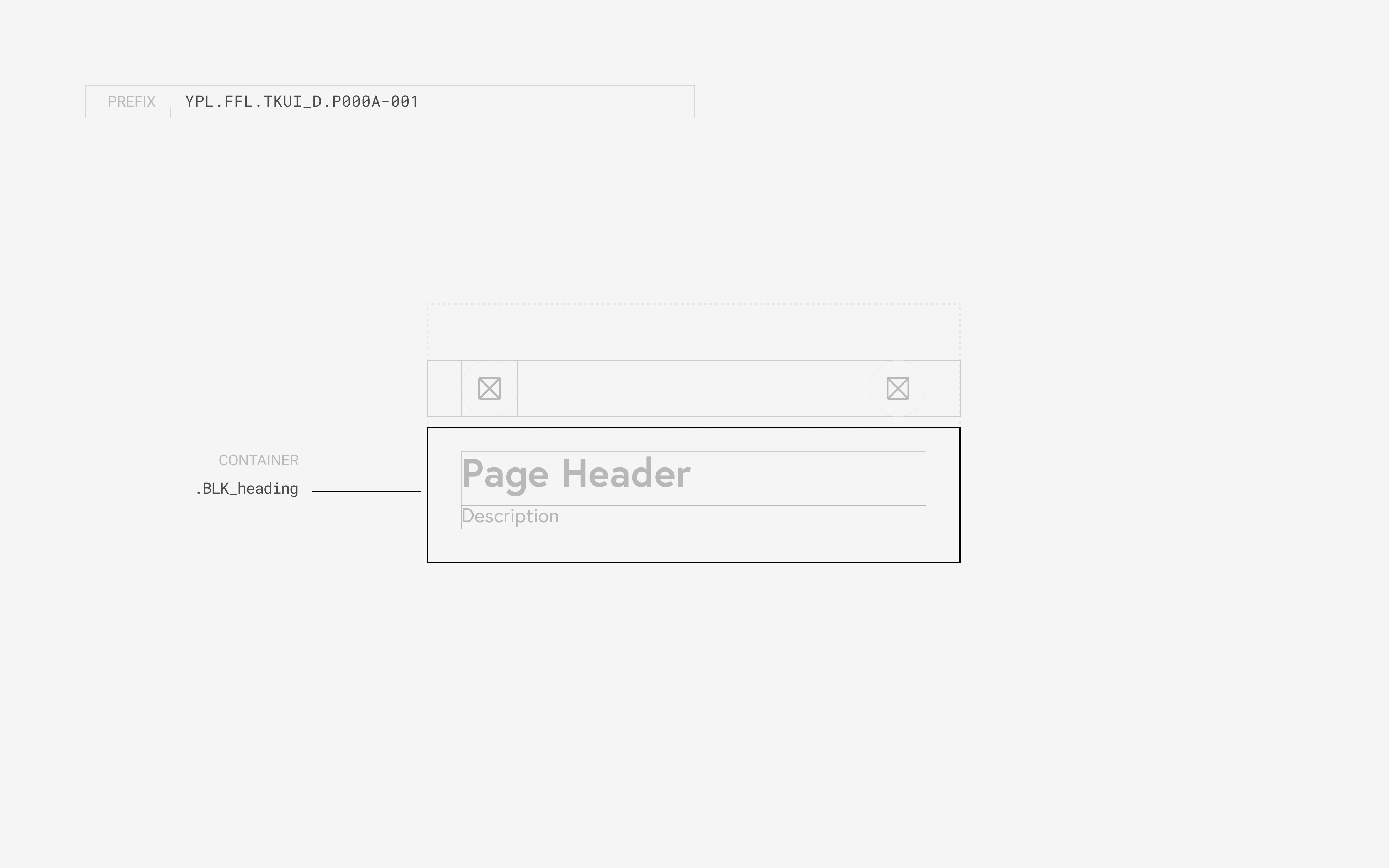
The next step was to systematically deconstruct the core components in order to identify their constitutional make-up. Inspired by Brad Frost’s atomic design methodology, our approach created a clear separation of concerns between visual design (primitives), functional components (elements), and user experience solutions (patterns).
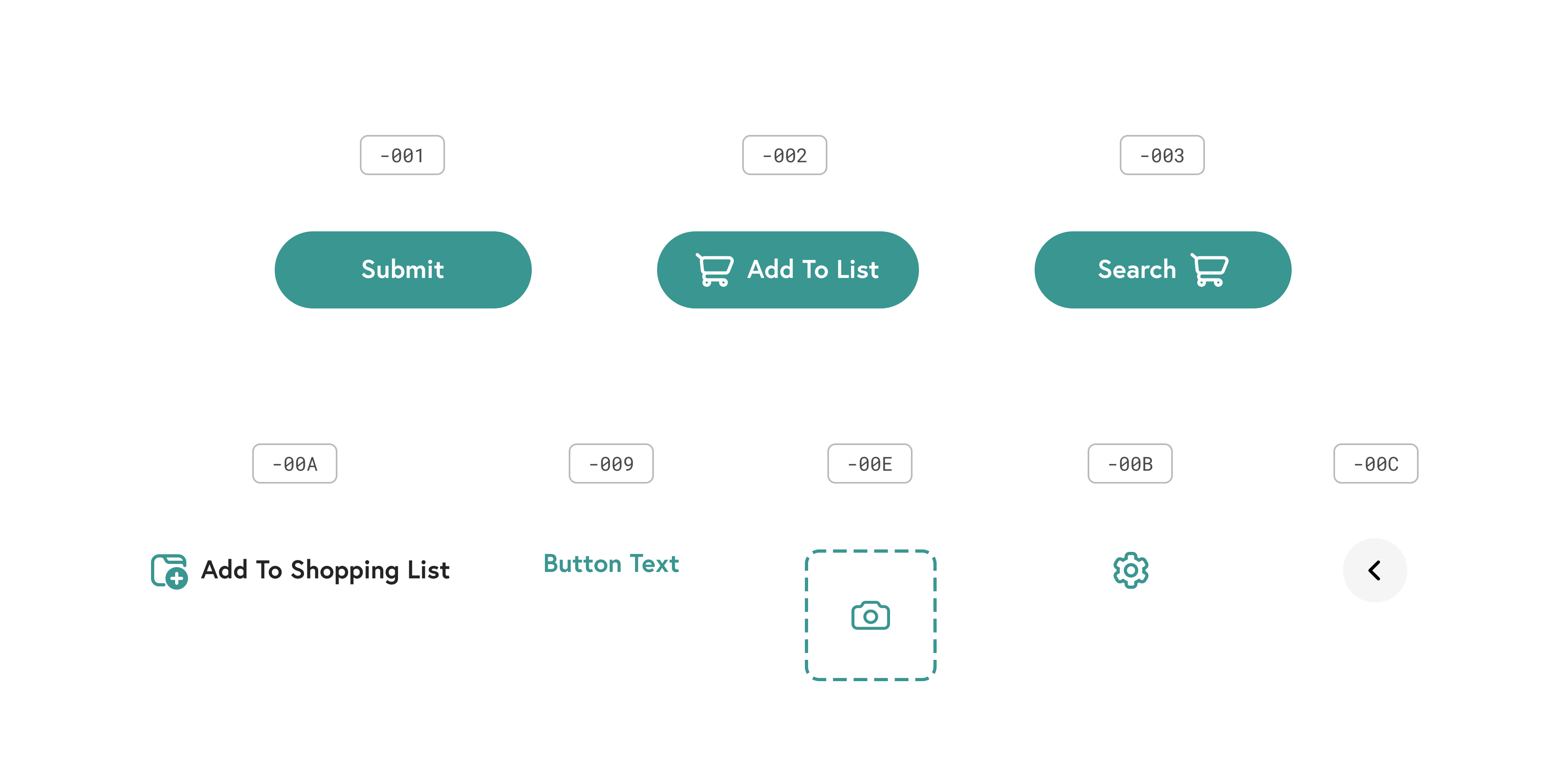
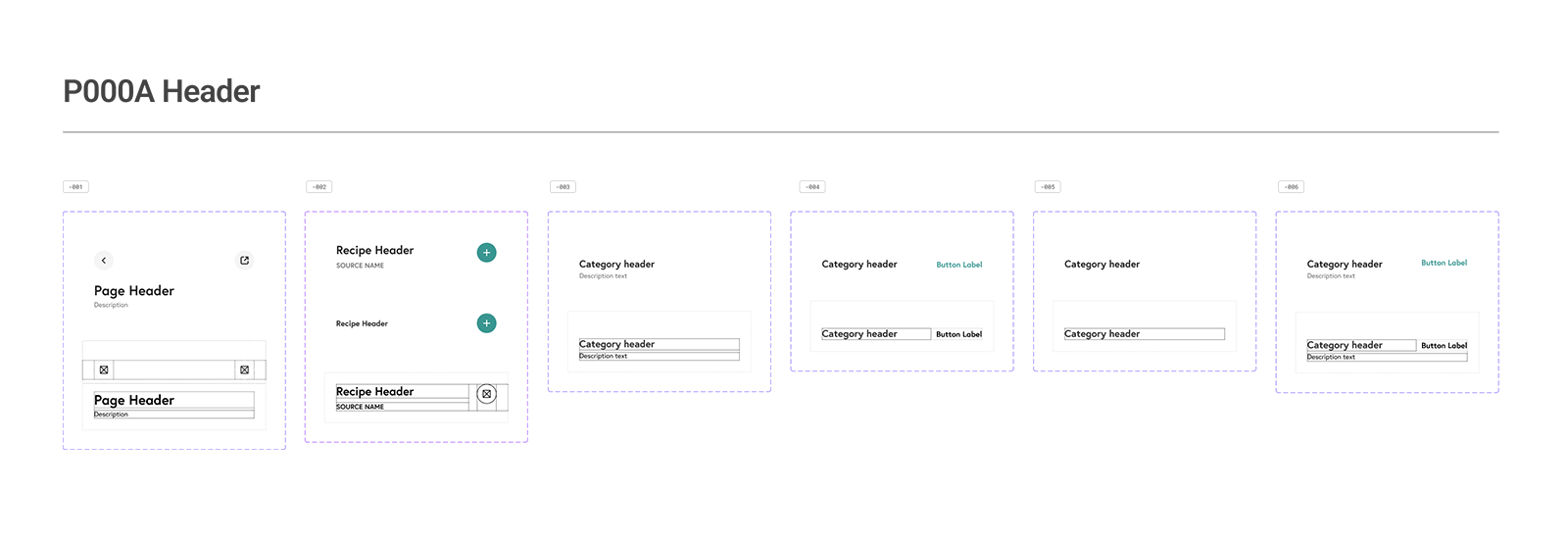
Each component is given both a unique alphanumeric identifier (UID) and a semantic description name to ensure systematic organization and traceability throughout the design system.
This framework maintains consistency across the entire design system, providing governance boundaries, reducing decision fatigue or errors, and giving designers and developers the ability to make systematic changes simply at any level.
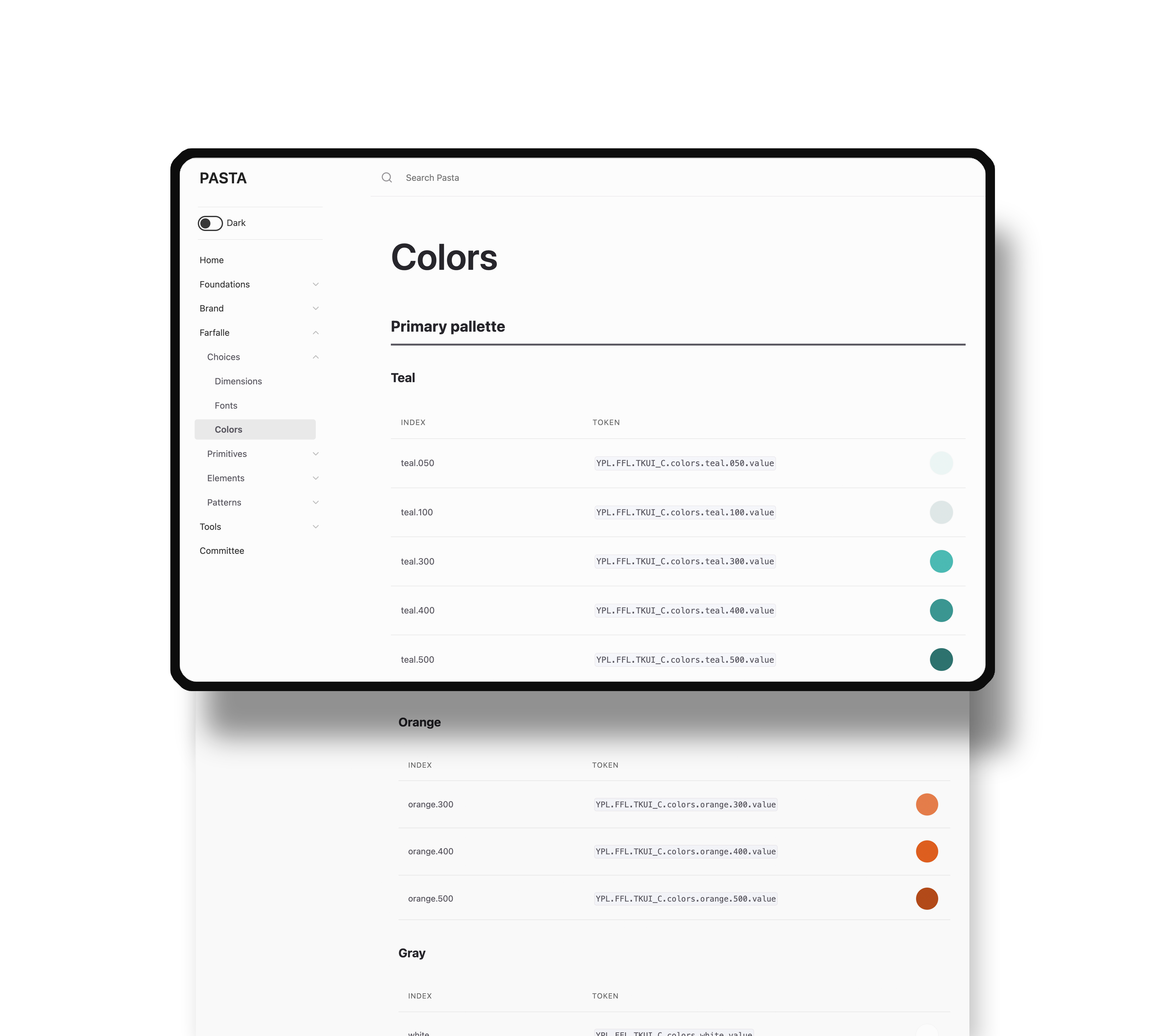
Primitives
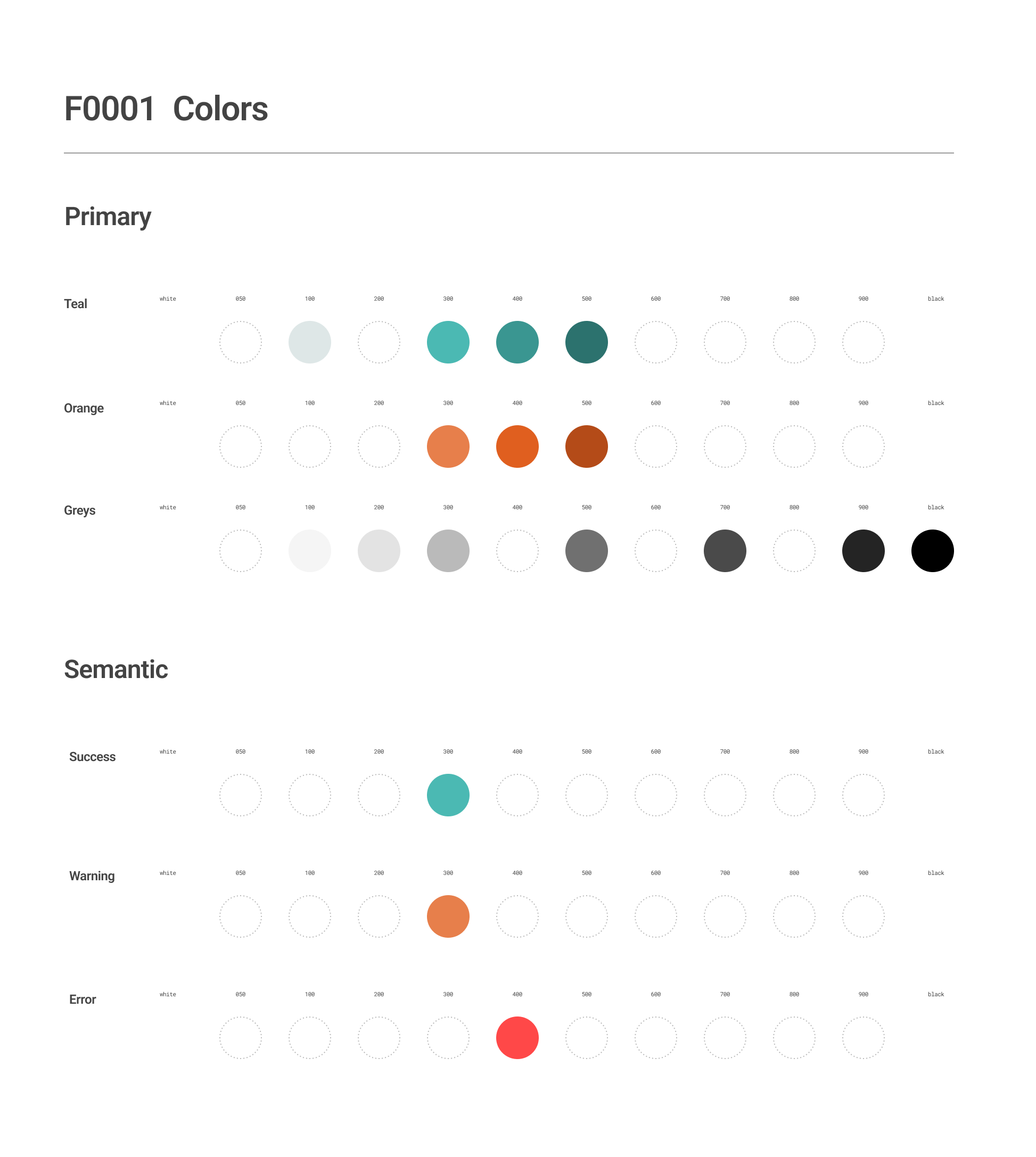
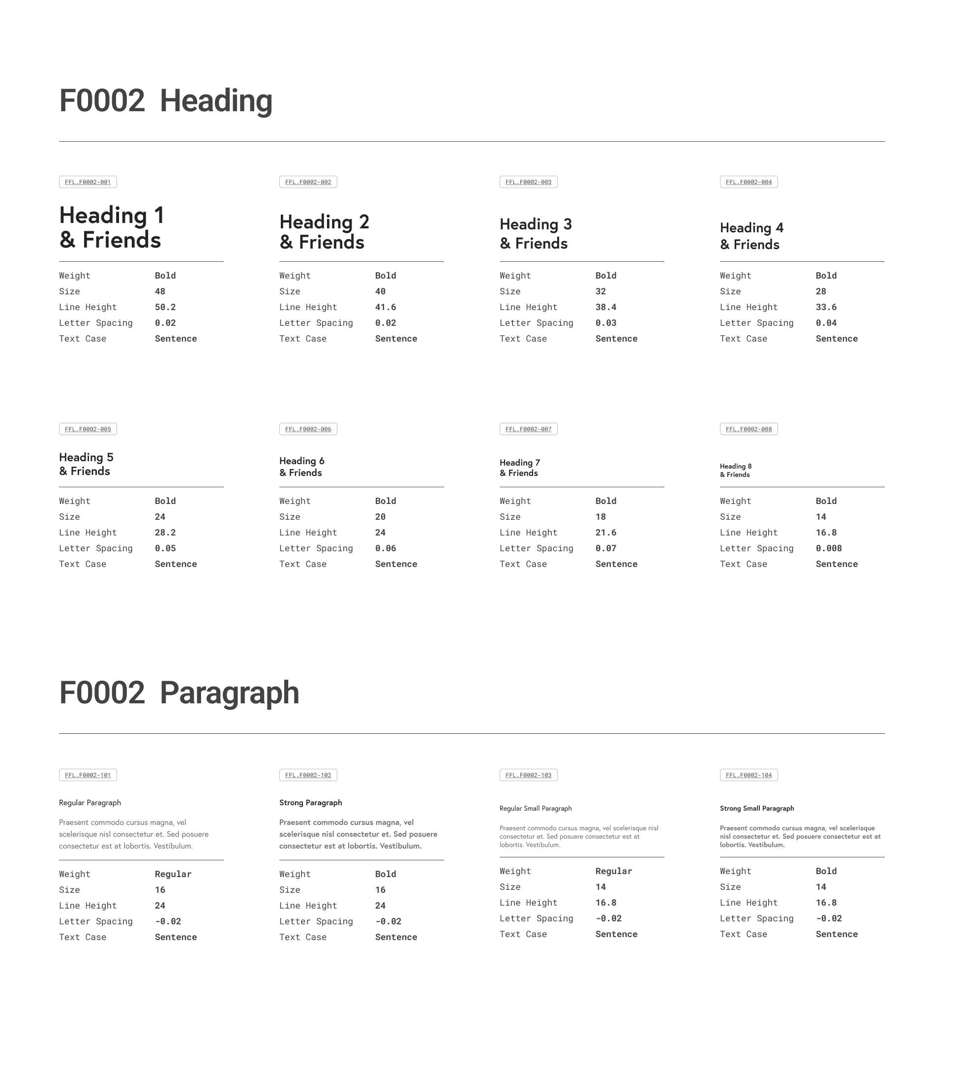
The foundational layer that remains consistent across all platforms. Primitives encompass the essential building blocks of any design and includes colors, typography, dimensions, and iconography.
Elements
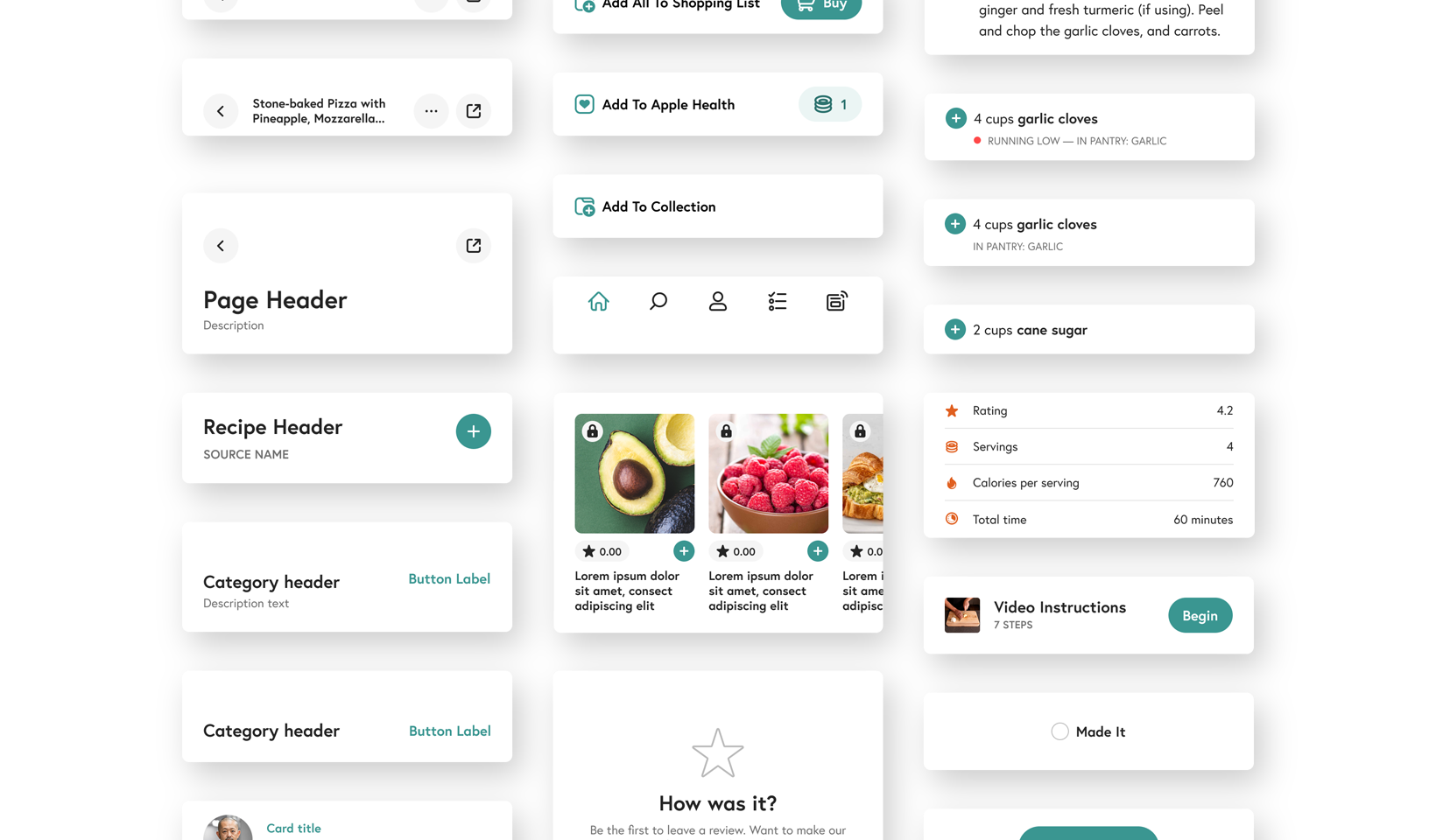
Functional UI components like buttons, inputs, and objects that combine primitives and design choices into reusable interface building blocks.
Patterns
Complex interface components that combine multiple elements to solve specific user experience needs, such as card layouts and navigational widgets.
Design Tokens
Design tokens represent the choices made by designers of how to apply the primitive components across element and patterns, e.g. the color of a primary button or font sizes and weights for headers. Each of these decisions were built into the design system as design tokens, to document the designer’s specification.
These design tokens are passed to engineers in code form (json) for implementation in the build, ensuring a seamless flow from design specification to production.
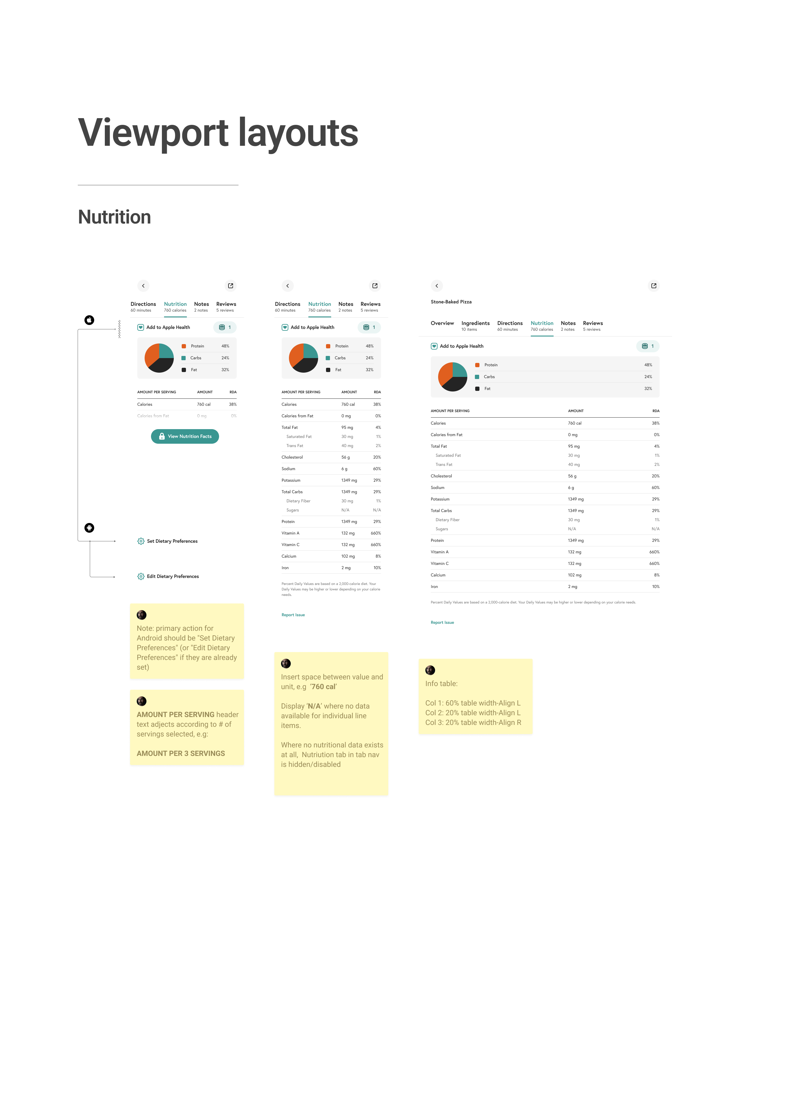
Modular and Responsive
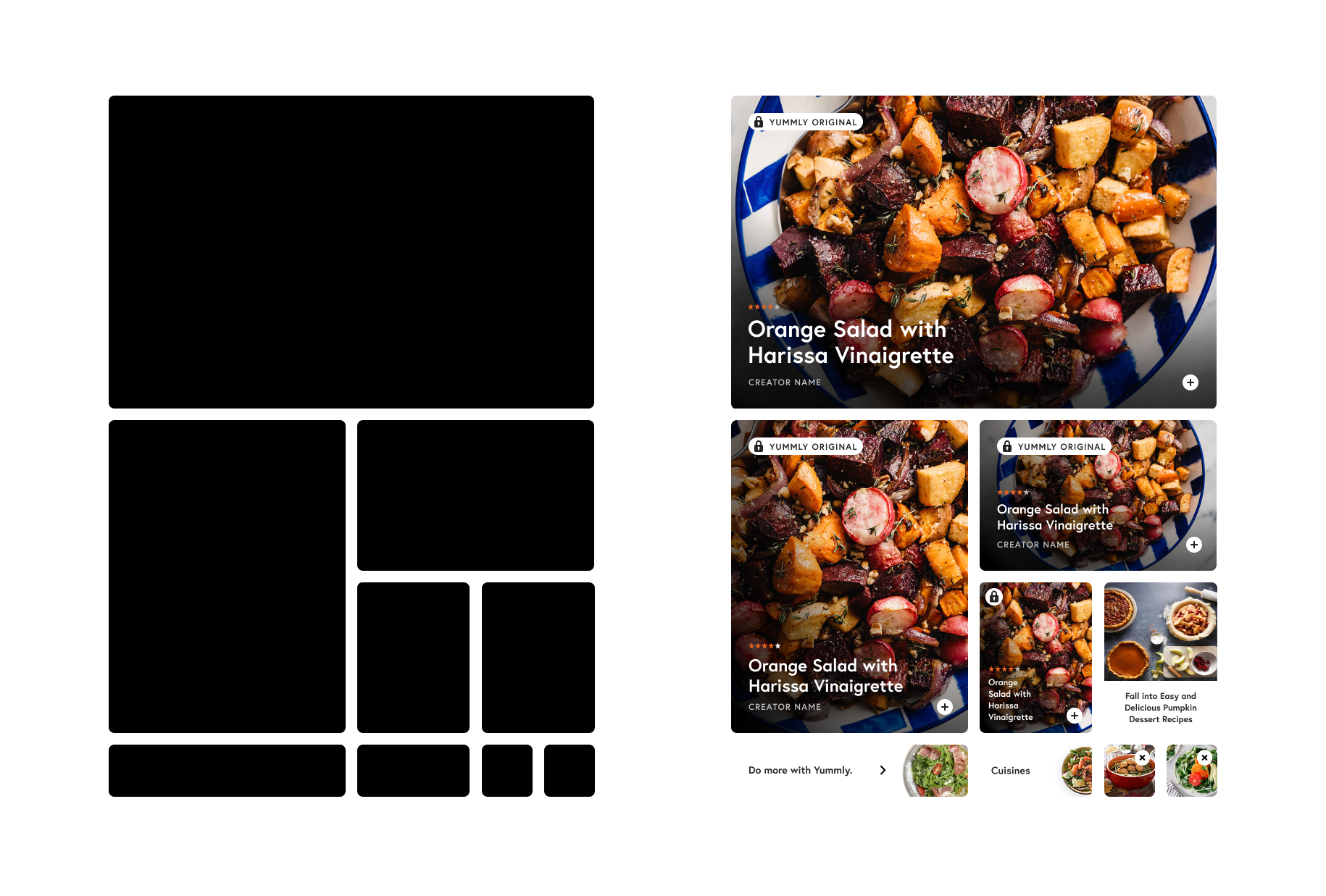
Modularity and Responsiveness were two of the key design principles that guided our design system development. Card components follow a proportional scale from small to large, creating infinite layout possibilities through interlocking arrangements while maintaining visual rhythm and clear content hierarchy.
Full-width components adapt seamlessly across mobile and tablet breakpoints. Token variants handle all viewport-based sizing adjustments, ensuring consistent responsive behavior throughout the system.
Documentation
To further support the development teams all components were documented to provide clear easy to follow instructions for implementation. Contained as blueprints with the master Figma file and in the online Pasta knowledge base, all components are published with detailed specification relating to; dependencies – primitives and elements required to create the components, decisions – design tokens used to convey choices, and layouts – how the component is constructed.
The online knowledge base fundamentally serves as the source of truth and hub for execution – providing links to the Figma library, full developer documentation, and downloadable json resources for design tokens.
Outcomes
The design system delivered measurable impact across engineering, design, and user experience.
For developers, implementation increased Jira issue completion rates by 48% while reducing the codebase by 63% and development files by 45%. This dramatic simplification meant teams could move faster without incurring extra technical debt. Designers experienced similar gains, with concept development cycles accelerating by 40% and handoffs to engineering becoming significantly more streamlined.
The business impact was equally compelling. When Pasta was used to redesign the home feed, the clickthrough on recipe cards increased x2 – validation of the outcomes that could be driven through the design system.
Critically, users also benefited from the added consistency. The unified design patterns and interaction behaviors created a more intuitive, predictable experience throughout the product. This standardization also enabled us to systematically address and resolve our highest-priority accessibility issues, making the platform more inclusive for all users.
Overall, the Pasta design system had a significant positive impact on design and development operations, and proved that investing in foundational infrastructure could deliver value to every stakeholder — from faster development cycles to improved user satisfaction and sustainable business growth.